# Theming
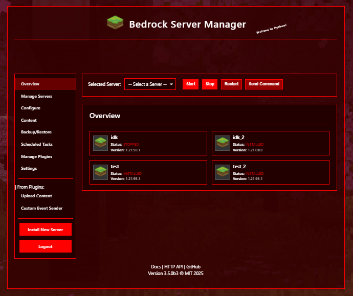
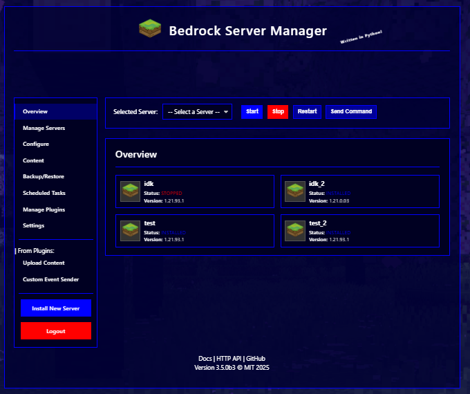
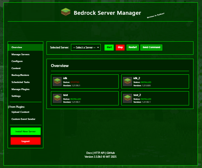
The Bedrock Server Manager web UI now supports theming, allowing you to customize the look and feel of the application.
## How it Works
Theming is done through CSS variables. The application defines a set of CSS variables that control the colors, fonts, and other style elements of the application. You can create your own custom themes by overriding these variables in a CSS file.
## Creating a Custom Theme
To create a custom theme, you will need to create a CSS file in the `themes` directory in your application data directory. The name of the file will be the name of your theme. For example, if you create a file named `my-theme.css`, your theme will be named `my-theme`.
Your theme file should contain a `:root` block that defines the CSS variables that you want to override. For example, to change the text color to red, you would add the following to your theme file:
```css
:root {
--text-color: red;
}
```
## Available Variables
The following is a list of the available CSS variables and what they control:
| Variable | Description |
| --- | --- |
| `--background-image` | The background image of the application. |
| `--background-overlay-color` | The color of the overlay that is displayed on top of the background image. |
| `--text-color` | The default text color. |
| `--container-background-color` | The background color of the main content container. |
| `--border-color` | The default border color. |
| `--header-text-color` | The text color of the header. |
| `--monitor-output-background-color` | The background color of the monitor output. |
| `--monitor-output-text-color` | The text color of the monitor output. |
| `--monitor-output-border-color` | The border color of the monitor output. |
| `--splash-text-color` | The color of the splash text. |
| `--button-background-color` | The background color of buttons. |
| `--button-border-color` | The border color of buttons. |
| `--button-text-color` | The text color of buttons. |
| `--button-hover-background-color` | The background color of buttons when hovered. |
| `--button-hover-border-color` | The border color of buttons when hovered. |
| `--button-hover-text-color` | The text color of buttons when hovered. |
| `--button-active-background-color` | The background color of buttons when active. |
| `--button-active-border-color` | The border color of buttons when active. |
| `--primary-button-background-color` | The background color of primary buttons. |
| `--primary-button-border-color` | The border color of primary buttons. |
| `--primary-button-text-color` | The text color of primary buttons. |
| `--primary-button-hover-background-color` | The background color of primary buttons when hovered. |
| `--primary-button-hover-border-color` | The border color of primary buttons when hovered. |
| `--primary-button-active-background-color` | The background color of primary buttons when active. |
| `--primary-button-active-border-color` | The border color of primary buttons when active. |
| `--danger-button-background-color` | The background color of danger buttons. |
| `--danger-button-border-color` | The border color of danger buttons. |
| `--danger-button-text-color` | The text color of danger buttons. |
| `--danger-button-hover-background-color` | The background color of danger buttons when hovered. |
| `--danger-button-hover-border-color` | The border color of danger buttons when hovered. |
| `--danger-button-active-background-color` | The background color of danger buttons when active. |
| `--danger-button-active-border-color` | The border color of danger buttons when active. |
| `--form-input-background-color` | The background color of form inputs. |
| `--form-input-border-color` | The border color of form inputs. |
| `--form-input-text-color` | The text color of form inputs. |
| `--form-input-focus-border-color` | The border color of form inputs when focused. |
| `--form-label-text-color` | The text color of form labels. |
| `--validation-error-text-color` | The text color of validation errors. |
| `--form-input-invalid-border-color` | The border color of invalid form inputs. |
| `--form-input-invalid-background-color` | The background color of invalid form inputs. |
| `--table-header-background-color` | The background color of table headers. |
| `--table-header-text-color` | The text color of table headers. |
| `--table-border-color` | The border color of tables. |
| `--table-row-hover-background-color` | The background color of table rows when hovered. |
| `--tab-background-color` | The background color of tabs. |
| `--tab-border-color` | The border color of tabs. |
| `--tab-text-color` | The text color of tabs. |
| `--tab-hover-background-color` | The background color of tabs when hovered. |
| `--tab-hover-text-color` | The text color of tabs when hovered. |
| `--tab-active-background-color` | The background color of active tabs. |
| `--tab-active-text-color` | The text color of active tabs. |
| `--message-success-background-color` | The background color of success messages. |
| `--message-success-border-color` | The border color of success messages. |
| `--message-success-text-color` | The text color of success messages. |
| `--message-error-background-color` | The background color of error messages. |
| `--message-error-border-color` | The border color of error messages. |
| `--message-error-text-color` | The text color of error messages. |
| `--message-warning-background-color` | The background color of warning messages. |
| `--message-warning-border-color` | The border color of warning messages. |
| `--message-warning-text-color` | The text color of warning messages. |
| `--sidebar-background-color` | The background color of the sidebar. |
| `--sidebar-border-color` | The border color of the sidebar. |
| `--sidebar-link-text-color` | The text color of sidebar links. |
| `--sidebar-link-hover-background-color` | The background color of sidebar links when hovered. |
| `--sidebar-link-hover-text-color` | The text color of sidebar links when hovered. |
| `--sidebar-link-active-background-color` | The background color of active sidebar links. |
| `--sidebar-link-active-border-color` | The border color of active sidebar links. |
| `--server-card-background-color` | The background color of server cards. |
| `--server-card-border-color` | The border color of server cards. |
| `--server-card-hover-background-color` | The background color of server cards when hovered. |
| `--server-card-info-text-color` | The text color of server card info. |
| `--server-card-info-label-color` | The text color of server card labels. |
| `--toggle-switch-off-background-color` | The background color of toggle switches when off. |
| `--toggle-switch-off-border-color` | The border color of toggle switches when off. |
| `--toggle-switch-off-handle-background-color` | The background color of toggle switch handles when off. |
| `--toggle-switch-off-handle-border-color` | The border color of toggle switch handles when off. |
| `--toggle-switch-on-background-color` | The background color of toggle switches when on. |
| `--toggle-switch-on-border-color` | The border color of toggle switches when on. |
| `--toggle-switch-on-handle-background-color` | The background color of toggle switch handles when on. |
| `--toggle-switch-on-handle-border-color` | The border color of toggle switch handles when on. |
## Plugin Theming
Plugins can also use the theme engine to style their own custom pages. To do this, you will need to use the CSS variables in your plugin's CSS files. For example, to use the theme's text color, you would use the following CSS:
```css
.my-plugin-text {
color: var(--text-color);
}
```
## Images